
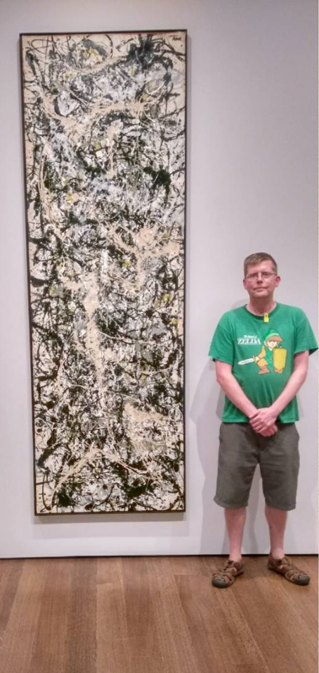
I went to the Harvard Fogg Art museum yesterday, one of my favorite museums just a few blocks away from my office in Harvard Square. A particularly tall painting by Jackson Pollock from 1950 titled Number 2 caught my eye. I took out my phone, searched the custom art database I spent the last 3 years building, and discovered it is, in fact, Pollock’s tallest painting at 287x91.4 cm. Harvard may or may not already know they have the tallest Pollock painting (it was not listed on the label), but I wonder if they know that it is more than twice the height of an average Pollock (86.67 x 99.81 cm.) ? That Pollock averaged 14.5 paintings per year, but the year he painted Number 2, he painted 56 paintings? My guess is they probably don't know all of that. Here's why.
We have over 550 art museums, 400+ collegiate art history programs, and the global art market does $60B+ in annual sales with individual works selling for more than one hundred million dollars... yet we lack good data and analytical tools for art. Even Google Search can’t answer the most basic questions about how many works our most important artists have made. Instead this information (when available) is locked inside rare, expensive, out-of-print, controversial, printed books called catalogues raisonnés .
What’s the impact of not having up to date and easily accessible data? Popular estimates say up to 20% of works in museums and galleries are either forged or misattributed often supported with fake documentation. Frustrated by how little we know about our most important cultural works, and how art history is being rewritten by forgers, I decided to create the Artnome database.
I have a vision where we use quantitative language to describe artworks in the same way as in business and sports. We don’t simply say Steph Curry of the Golden State Warriors is “really good”. We say things like Curry has a .438 three point shooting percentage, the best of any active player. Why get so nuanced in our analysis? We measure and quantify the things we care about to better understand them, deepen our enjoyment of them, to tell better stories around them, and to make better decisions and investments.
By combining information from catalogues raisonnés, auctions, and exhibitions, we can tap into new cultural context and build sophisticated market intelligence for art. With a complete view of an artist's work, we are able to create sports-style statistics highlighting the elements that make artists and their work unique.
Below are sample analytics for Vincent Van Gogh and Jackson Pollock from the database.
Although both artists lived short lives (Pollock died at 44 and Van Gogh at 37), Van Gogh produced more than twice the number of paintings of Pollock.

This is especially impressive when considering Van Gogh was active as a painter just nine years vs Pollock's 25 years of activity.

In those short nine years, Van Gogh averaged 96 paintings a year, roughly a painting every four days. Pollock averaged just 14.5 paintings a year.

Pollock's total number of paintings created may have been less than half the number of Van Gogh, but at 506 square yards (a little over a third the area of an Olympic swimming pool) Pollock beats out Van Gogh's 322 square yards for total surface area painted.

Pollock managed to paint more surface area than Van Gogh (despite creating fewer paintings) by creating work in much larger dimensions. It would make sense that Van Gogh's canvases were smaller, as he often painted on-site directly from observation, which would require the transport of the canvas.

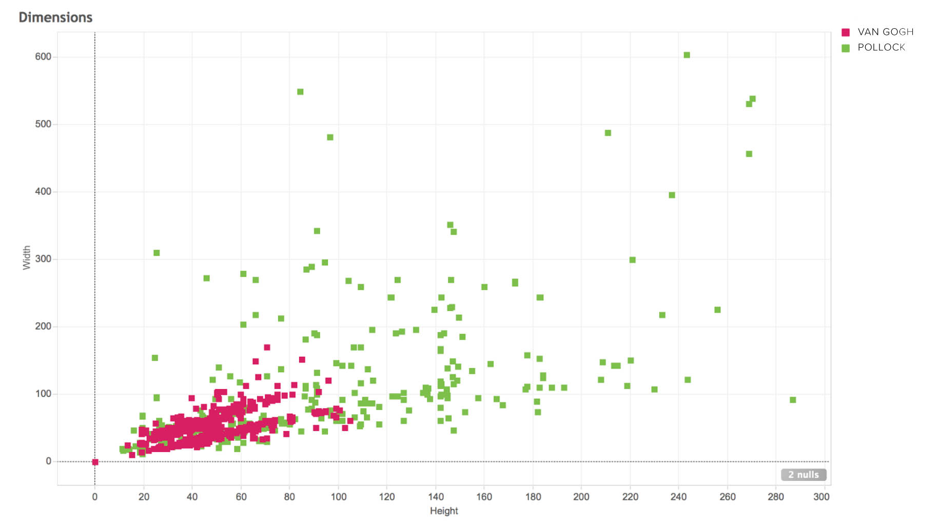
Van Gogh's canvases also generally adhere to the French standard sizes for oil paintings as dictated by the arts materials suppliers of the day. When charting the width and height of all works by both artists, it is easier to see the contrast in size and variability.
The premise of Moneyball is that the collective wisdom of baseball insiders was subjective, potentially flawed, and could be taken advantage of using better analytics. Might we be able to build a better art collection for less money with more advanced analytics?
If we look at auction data we can establish an average cost per painting sold at auction and an average cost per square centimeter based on total surface area of the works sold.


We can then multiply these average prices against the total number of paintings created and the total area painted to establish a range of values for the artist's complete works. In this case Van Gogh's complete paintings are estimated in a range roughly triple the complete works of Pollock. Does this seem right to you? If you believed Pollock to be the better artist, you might see this as a sign that the market undervalues his work.

One theory I have is that artists with a very high output, (for example, Alexej Jawlensky, who produced 2,158 paintings), will have value ranges that that far exceed equally or better-known artists with significantly fewer works (Barnet Newman, for example, with 141 paintings). Now imagine you could establish a league average by creating predictive value ranges for the complete works of 50 to 100 of the best-known artists. Could that type of statistic, albeit in need of refinement, lead to a potential market correction through a better understanding of relative supply? More on that in the next post which will dig deeper into financial metrics including ratio of works created to works sold, works in private vs public hands, and the correlation between size, year created, and sale price at auction.
Interested in getting your hands on some data or helping us to build the largest database of known works across the world's most important artists? Join the free Artnome Slack community.